Typical issues in creating and sharing reports following data analysis: An overview of report quality improvement
Data analysis is a valuable resource for businesses to make informed decisions and enhance their strategies. However, it is not enough to simply complete the analysis. The full impact of the findings requires clear and understandable presentation.
To effectively communicate knowledge gained from data analysis to employees and stakeholders, well-designed reports are essential, and their distribution is critical. Privacy also needs to be considered, as appropriate internal dissemination needs to protect personal data.
In this article, we explore common issues related to creating and sharing reports after data analysis and how AnalyticsGate can help overcome them.
The importance of reporting in data analysis
Report creation is crucial for data analysis. It involves designing content that is both comprehensible and relevant to stakeholders.
Reports must convey complex information and answer specific questions. For this reason, a tailored report is provided to each recipient or interest group where applicable.
For example, a salesperson is not going to get a comprehensive report on how much the organisation sells. Instead, a separate report is provided to them, containing their individual sales figures. This guarantees the creation of pertinent and easily understood reports which take privacy issues into account. As a result, reporting becomes an efficient instrument that grants appropriate personnel access to the relevant data and significantly contributes to strategic decision-making.
Reports not only present the results of data analyses, but also serve to verify the accuracy of the data itself. A well-crafted report can highlight inconsistencies, anomalies, or errors in the data that were missed during the analysis phase. This can improve the quality of the data and the accuracy of the analysis results.
Reports can boost the transparency and traceability of business operations and corporate processes. This increases confidence in data analysis and establishes a basis for informed discussion and decision-making.
How can AnalyticsGate provide assistance?
At AnalyticsGate, we recognize the significance of reporting in data analysis. Our Excel Add-In provides a variety of features to streamline and augment the report creation process. AnalyticsGate is an all-in-one solution for your reporting requirements, ranging from data preparation and visualisation to report distribution.
Problem 1: Unclear or incomplete data visualisation
Analysing data without visualisation is impractical. Hence, ensuring precise data visualisation is vital. Data visualisation helps to understand and illustrate large datasets. Due to its significance, incomplete or vague representations can cause severe issues.
Unclear illustrations may lead to crucial information being overlooked or the data being misinterpreted, ultimately resulting in erroneous decisions that could negatively impact the company. Incomplete visualisations of data can lead to incorrect analyses and decisions, as they fail to consider all pertinent information.
An example of incomplete visualisation
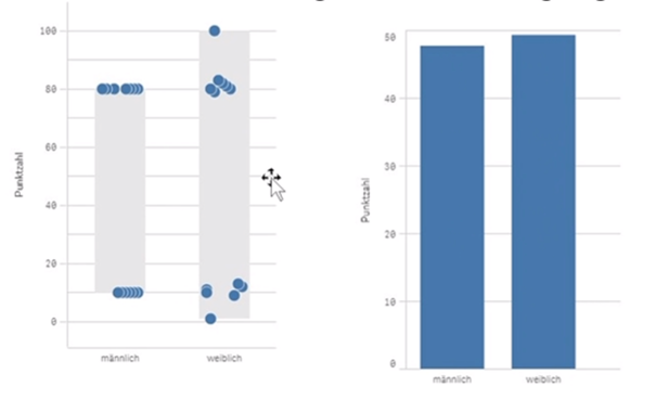
An example of an incomplete or partial visualisation is the use of a graph designed for ordinal scale data that contains metric data. To illustrate, consider a scenario: Envision displaying customer satisfaction levels in a company over five years. Customer satisfaction is categorised on an ordinal scale as 'very dissatisfied', 'dissatisfied', 'neutral', 'satisfied' and 'very satisfied'.
Using a line graph suitable for metric data, such as sales numbers or temperatures, may cause issues when inputting ordinal scaled customer satisfaction data into the graph. As the intervals between customer satisfaction categories are unequal, the graph may produce a distorted image.
This may lead to information loss in visualisation, and important trends or variations in customer satisfaction may be overlooked.
How can AnalyticsGate provide assistance?
AnalyticsGate can improve the clarity and comprehensiveness of data visualisations. By integrating Excel's versatile visualisation tools with Qlik Sense, AnalyticsGate enables users to depict complex data sets in a clear and simple way. Additionally, AnalyticsGate's dynamic update function ensures that your visualisations always reflect the latest data.
Problem 2: Excessive or inadequate detail
In reporting, achieving a balance between detail and clarity is an art form. The challenge lies in providing sufficient detail to paint a complete and accurate picture of the analysed data, whilst maintaining the report's clarity and easy comprehensibility.
Reports that contain excessive detail risk appearing cluttered and unclear, making it difficult for viewers to identify the pivotal information. In a business context, this can lead to valuable insights being overlooked or undervalued.
On the other hand, reports with insufficient details can present an inadequate or misleading representation of the analysed findings. Important trends or patterns may go unnoticed, and the resulting decisions may not take into account the full complexity of the processes.
An example of insufficient detail
An example of inadequate detail is a report that only displays monthly sales figures for different products without providing any information on daily or weekly sales fluctuations. Without this level of detail, the report may not accurately reflect sales trends, seasonal effects, or other important patterns significant for decision-making.
How can AnalyticsGate provide assistance?
AnalyticsGate helps achieve the ideal level of report detail. With our Excel Add-In, you can effortlessly customize report granularity, selecting the optimal level of detail that suits your business needs. This allows for the tailoring of reports to suit different recipients, resulting in more valuable reports for your company. This ensures that each report serves its purpose effectively.
Problem 3: Missing Meta Information
In data analysis and reporting, context is crucial. Data sets and metrics can easily be misunderstood without the right context, leading to erroneous interpretations and decisions. Meta information can take many forms, including historical data, industry-specific information, demographic data, and more.
An example of missing meta information
One example of incomplete meta information would be a graph showing the monthly sales statistics of a product over a 12-month period, but without any information about seasonal effects, promotions or other elements that could have affected the sales statistics. In the absence of this background information, readers of the report will encounter difficulties in comprehending the reasons for changes in sales statistics and in making precise forecasts or choices grounded on the data.
How can AnalyticsGate provide assistance?
AnalyticsGate offers a variety of features that allow users to incorporate meta information into their reports. With AnalyticsGate, you can merge and analyse data from different sources to provide a complete and accurate picture of the analysed data. You can include historical data, demographic information, industry-specific figures, and much more in your analysis.
Problem 4: Insufficient data reliability or data integrity
The reliability of data analysis depends on the clarity and accuracy of the underlying data. If the data underlying the reports is flawed, incomplete, or inconsistent, the resulting conclusions may be misleading.
An example of Insufficient data reliability or data integrity
An example of poor data quality would be a dataset with many missing or incorrect values. Such data undermines the precision of data analysis and the legitimacy of the resulting reports. An example of poor data integrity would be a dataset with inconsistencies, such as different formatting for the same date or value.
How can AnalyticsGate provide assistance?
With AnalyticsGate, you can improve the quality and accuracy of your data. Our tool offers both manual and automatic data cleansing functions that allow you to detect and correct missing or incorrect values. It also offers data validation functions that allow you to verify the consistency of your data and ensure compliance with defined business rules.
Summary and conclusion
Reporting and distributing data analysis findings is a crucial step towards making the information gained from analyses available within your business environment. Nonetheless, there are several obstacles and challenges that can impact the reports' quality and usefulness, including unclear or incomplete visualisations, insufficient detail, and missing meta information. The data's quality and integrity can also be problematic.
Fortunately, there are tools and solutions available to resolve such issues. AnalyticsGate is a tool that can import data from Qlik Sense into Excel, combining Qlik Sense's powerful data analysis components with Excel's tools. This provides AnalyticsGate with a flexible solution for comprehensive and reliable data evaluation.
Whether you need to improve your data visualisations, adjust report depth, incorporate meta information, share your reports, or improve data quality and integrity, AnalyticsGate is the ideal tool for the job.

Thomas Hänig
Head of Development and Data Analyst
Consultant AnalyticsGate